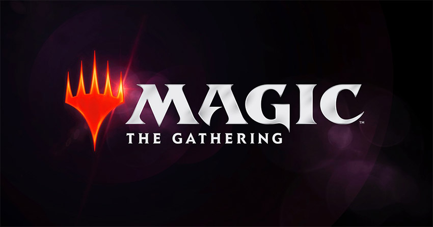
In 2018, Magic: the Gathering switched to an entirely new logo...which was successful largely in keeping the old logo for the card backs.
From it's inception in 1993 through to 2017, Magic: the Gathering pretty much had the same logo (albeit with some minor variation over the years). Created by legendary Magic artist Christopher Rush (who also did the art for many a Magic card including the Black Lotus), the original logo went through three minor iterations.
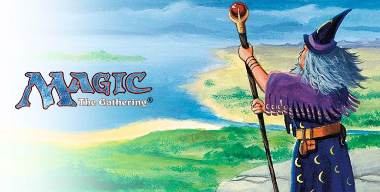
There was the original "ice blue" logo of the 90s.

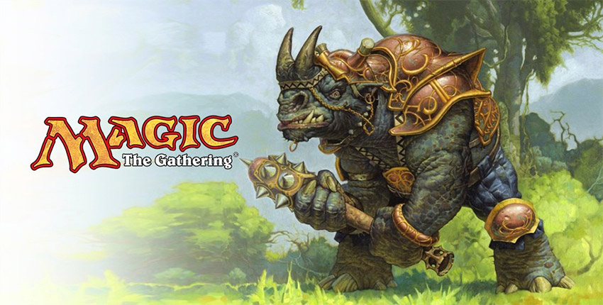
That was then replaced by the yellow logo. Introduced in 1999 and used through 2015, it was a much more eye-catching color scheme that went along with the long-standing popularity of the game.

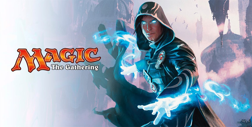
After that came the relatively short-lived, bold orange variation of the collectible card game's logo.

As creators would later say, a design change was desperately needed by 2018.
In their own words: "But the 2015 refreshed logo wouldn't hold up for long. In a number of ways, it didn't zero in close enough to the brand's modern fantasy core. Magic's visuals draw inspiration from many cultures and wonders from our world, as well as from wild imagination, reaching well beyond the medieval high-fantasy aesthetic from which the original logo was drawn. Additionally, Magic was centering itself around ownable features like Planeswalkers and high-concept worlds—the building blocks of a brand that can see itself not only as a game, but as an entertainment property."
There were a lot of problems with the proposed change though.
Card backs with an entirely redesigned logo could be seen by players and, thus, could be used to cheat by figuring out older and newer cards. And that's not to mention upending a lot of players collections.
Luckily, this was solved by the simple plan of just not changing it, and keeping the same card backs around as a nod to the history and legacy of the game (and not angering players or causing disadvantages in the process).
That new logo is the one we still have today in 2026.

It had a very mixed reception upon release, though it didn't quite have the Cracker Barrel backlash where they had to reverse course a few days later or anything. But fans at the time were divided (with some today still preferring the old logo).
Questionaires to fans brought a lot of distressing responses to Wizards of the Coast, calling the logo "generic", "sterile", or worst of all "unmagical". However, for others, the planeswalker symbol logo showed how Magic was now progressing, was more modern, and, unlike the script logo, gave a symbol to the game that could be readilly identifiable.
So why didn't the backlash kill the new logo? Consensus is that (A) Wizards of the Coast sunk a lot of money into branding and really didn't want to reverse course, (B) many fans did actually like it, (C) many that didn't like it were placated that the card backs wouldn't change as a result, and (D) the thought was that many would simply accept the new one over time.
Many players and fans did give it a chance, and today, almost a decade later, the planeswalker Magic logo is seen as the CCG's main branding. But for many, the reason it survived was because Magic kept the card backs, as many players and developers would later say.
If they hadn't...who knows what the logo, or card backs, would like like today.


